Have you ever wanted to create an app with an appealing interface that works in the command line? Welcome to Textual, a Python toolkit and framework for creating beautiful, functional text-based user interface (TUI) applications. The Textual library provides a powerful and flexible framework for building TUIs. It offers a variety of features that allow you to create interactive and engaging console applications.
In this tutorial, you’ll learn how to create, style, and enhance Textual apps with layouts, events, and actions.
By the end of this tutorial, you’ll understand that:
- Python Textual is a framework for building terminal-based applications with interactive and visually appealing text interfaces.
- Textual works by providing a set of widgets, layouts, and styling options, enabling you to create responsive and interactive console apps.
- Textual is useful for building efficient, platform-independent text-based user interfaces that work over remote connections and in low-resource environments.
Textual is built on Rich, a Python library for creating rich text and beautifully formatted terminal output. It enhances text-based applications by applying colors, styles, and formatting to your text output in Python.
Get Your Code: Click here to download the free sample code that shows you how to use Python Textual to Build Beautiful UIs in the Terminal.
Take the Quiz: Test your knowledge with our interactive “Python Textual: Build Beautiful UIs in the Terminal” quiz. You’ll receive a score upon completion to help you track your learning progress:

Interactive Quiz
Python Textual: Build Beautiful UIs in the TerminalIn this quiz, you'll test your understanding of the Python Textual library. This library is used to create rich terminal applications and widgets. By working through this quiz, you'll reinforce your knowledge of Textual's key concepts and features.
Installing Textual
Textual requires Python 3.8 or later to work. As with any new Python project, it’s a good idea to create a virtual environment before you start. This helps keep your system’s Python environment clean and prevents unnecessary dependencies that may cause trouble later on.
Note: To learn more about Python virtual environments, check out Python Virtual Environments: A Primer.
Once you have the Python virtual environment, you can install Textual from PyPI using pip, which is the package installer for Python.
Note: To learn more about pip, check out Using Python’s pip to Manage Your Projects’ Dependencies.
Open a command-line console and create a directory to host your Textual code. Then, run the commands below to create a virtual environment, activate it, and install Textual:
Here, you first create a virtual environment using the venv module from the standard library. Then, you activate it, and finally, you install Textual using pip.
You’ve installed two packages:
textualis the library and application framework that’ll provide the machinery for your TUI applications.textual-devcontains a command-line tool, also namedtextual, that facilitates debugging and interactive development through the Textual console.
In what follows, you’ll mostly be using the textual library, but you’ll also see an example of how to use the textual tool from textual-dev.
Checking the Textual Installation
The textual package is now installed in your Python virtual environment. You can check your installation by running the following command:
(venv) $ python -m textual
You should see the Textual demo app, a nicely formatted TUI application that displays useful information about Textual’s capabilities. You can interact with it using the mouse or keys:
Notice the colored text, emojis, structured layout, and the keyboard shortcuts listed in the window footer. There’s a lot to explore here, but for now, you’re going to dive right in and create your first app using Textual. You can close the demo by pressing Ctrl+C.
Getting to Know Textual
Textual is an application framework that provides classes and services for building fully-fledged applications. Its event-driven programming model lets you define callbacks for various events, such as key presses, mouse clicks, and timer ticks.
You can also define actions, which are functions that the user can call using a keystroke, or by clicking a text link. Events and actions let you build interactive TUIs.
Key features of Textual include:
-
Rich widget library: Offers a comprehensive set of widgets such as buttons, inputs, checkboxes, switches, and more, allowing you to build interactive interfaces efficiently.
-
Flexible layout management: Provides various layout options, including docking and grid systems, allowing you to design complex interfaces that adapt to different terminal sizes.
-
Reactive attributes: Supports reactive programming, enabling the creation of dynamic interfaces that respond seamlessly to changes in application state.
-
CSS styling: Uses a CSS-like syntax to customize widget appearance and behavior, which allows for customization of the appearance and behavior of widgets to match specific design requirements.
-
Asynchronous event handling: Built on Python’s
asyncio, it efficiently manages asynchronous events, ensuring responsive user interactions even in I/O-bound applications. -
Command palette: Includes a command palette with fuzzy search capabilities, enhancing user navigation and command execution within the application.
-
Accessibility features: Designed with accessibility in mind, offering integration with screen readers, monochrome mode, high-contrast themes, and color-blind themes to accommodate diverse user needs.
-
Cross-platform compatibility: Runs on various platforms, including Windows, macOS, and Linux, ensuring broad usability across different operating systems.
-
Remote application support: Enables applications to run over SSH, making it easier to manage servers and develop remotely.
-
Integration with Rich: Leverages the Rich library to provide advanced text formatting, syntax highlighting, and rendering capabilities, enhancing the visual appeal and functionality of terminal applications.
All in all, Textual provides everything you need to build beautiful, responsive text-based interface applications.
Creating Your First Textual App
It’s time to create your first Textual app! You’ll start with something minimal, just to check that everything works as expected. Fire up your favorite code editor or IDE and create a new Python file called hello_textual.py. Then, add the following code:
hello_textual.py
 1from textual.app import App
 2from textual.widgets import Static
 3
 4class HelloTextualApp(App):
 5    def compose(self):
 6        yield Static("Hello, Textual!")
 7
 8if __name__ == "__main__":
 9    app = HelloTextualApp()
10    app.run()
This is about the quickest Textual app you can write. On lines 1 and 2, you import the App class from textual.app and the Static class from textual.widgets.
The App class represents a generic Textual application. By deriving your application from App, you inherit a lot of Textual’s architecture.
Static is your first bare-bones widget class. A widget is a UI component that manages a rectangular area on your screen. It’ll appear in the UI of your app, and it may also respond to events and actions, which you’ll work with more a little later in this tutorial.
On lines 4 to 6, you define a custom class called HelloTextualApp by inheriting from App. Then, you override its .compose() method.
Textual uses this method to build the application’s UI. In this example, the UI consists of a single Static widget implicitly contained in a Screen object, but in general, it can be built from a complex hierarchy of containers and widgets.
You can run the app by executing the following command:
(venv) $ python hello_textual.py
Here’s how the app looks:
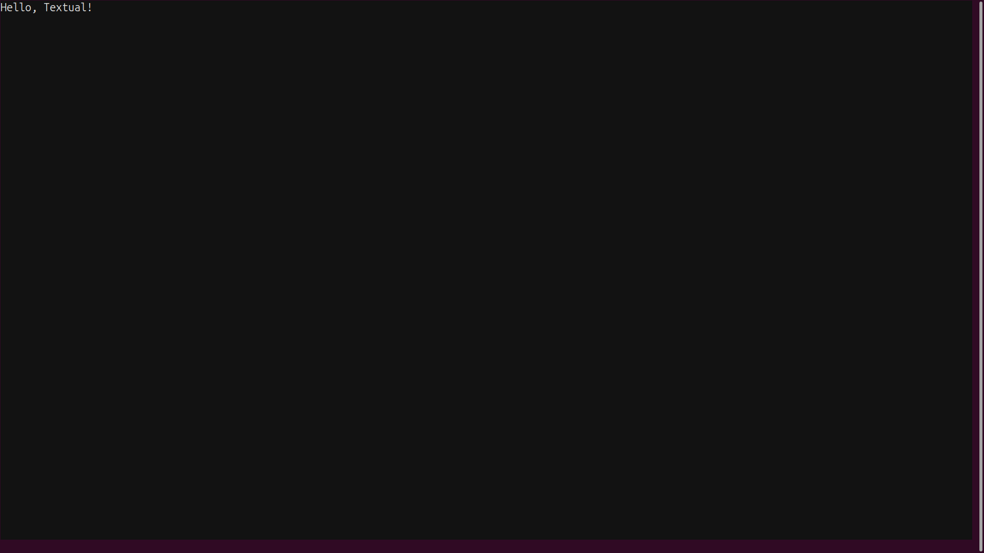
This hello_textual.py application demonstrates the basic scaffolding on which you can build more complex and interesting apps. When you’re tired of admiring your first Textual application, you can press Ctrl+Q to return to your system console.
In the next section, you’ll take a closer look at widgets and how to include them in your application.
Exploring Textual Widgets
Textual offers a variety of widgets, including buttons, checkboxes, input fields, progress bars, and more. Again, a widget is a graphical component that represents a UI control and occupies a rectangular area of the screen. Textual provides both basic widgets and more advanced ones.
In Textual, each widget can have its own set of style settings and can respond to particular events like keystrokes, mouse clicks, timer ticks, and others.
Static and Label Widgets
Static and Label are the most basic widgets in Textual. You’ve already used Static, which manages a rectangular area on the screen with some optional text. Label is quite similar to Static, though it’s specialized for displaying text.
Even these elementary widgets have some surprising powers—like all Textual widgets, they can display rich text renderables as defined by the Rich library’s renderable protocol. This means you can specify the text’s foreground and background colors, as well as text formats like bold, italic, and even flashing effects.
Besides text styling, you can also assign any widget its own background color and frame style. You can also use a wide range of emojis.
Note: Textual fully supports Unicode characters, letting you display text in various natural languages and a wide variety of symbols. This makes it suitable for internationalization and localization.
Here’s a bare-bones example using Static and Label widgets, along with some rich text and styling:
static_and_label.py
from textual.app import App
from textual.widgets import Label, Static

class StaticAndLabelApp(App):
    def compose(self):
        self.static = Static(
            "I am a [bold red]Static[/bold red] widget!",
        )
        yield self.static
        self.label = Label(
            "I am a [yellow italic]Label[/yellow italic] widget!",
        )
        yield self.label

    def on_mount(self):
        # Styling the static
        self.static.styles.background = "blue"
        self.static.styles.border = ("solid", "white")
        self.static.styles.text_align = "center"
        self.static.styles.padding = 1, 1
        self.static.styles.margin = 4, 4
        # Styling the label
        self.label.styles.background = "darkgreen"
        self.label.styles.border = ("double", "red")
        self.label.styles.padding = 1, 1
        self.label.styles.margin = 2, 4

if __name__ == "__main__":
    app = StaticAndLabelApp()
    app.run()
This time, .compose() yields two widgets with some rich renderable content. You’ve saved a reference to each widget before calling yield, at which point Textual adds the widget to the app’s screen.
The .on_mount() method is an event handler, which decides what should happen if an event occurs. Textual automatically calls this method before the screen is rendered. Textual, like HTML, builds the UI into a document object model (DOM) that’s a hierarchy of containers and widgets. You can locate any Textual object in this hierarchy by a DOM query that references its Python class, or its unique ID if available.
At this point, the DOM of your Textual app is fully constructed. You can use your saved references self.static and self.label to apply styles to the widgets, which you do with their .styles attributes.
Go ahead and run static_and_label.py in your command line:
(venv) $ python static_and_label.py
Admire the result of your efforts to build and style a Textual UI:
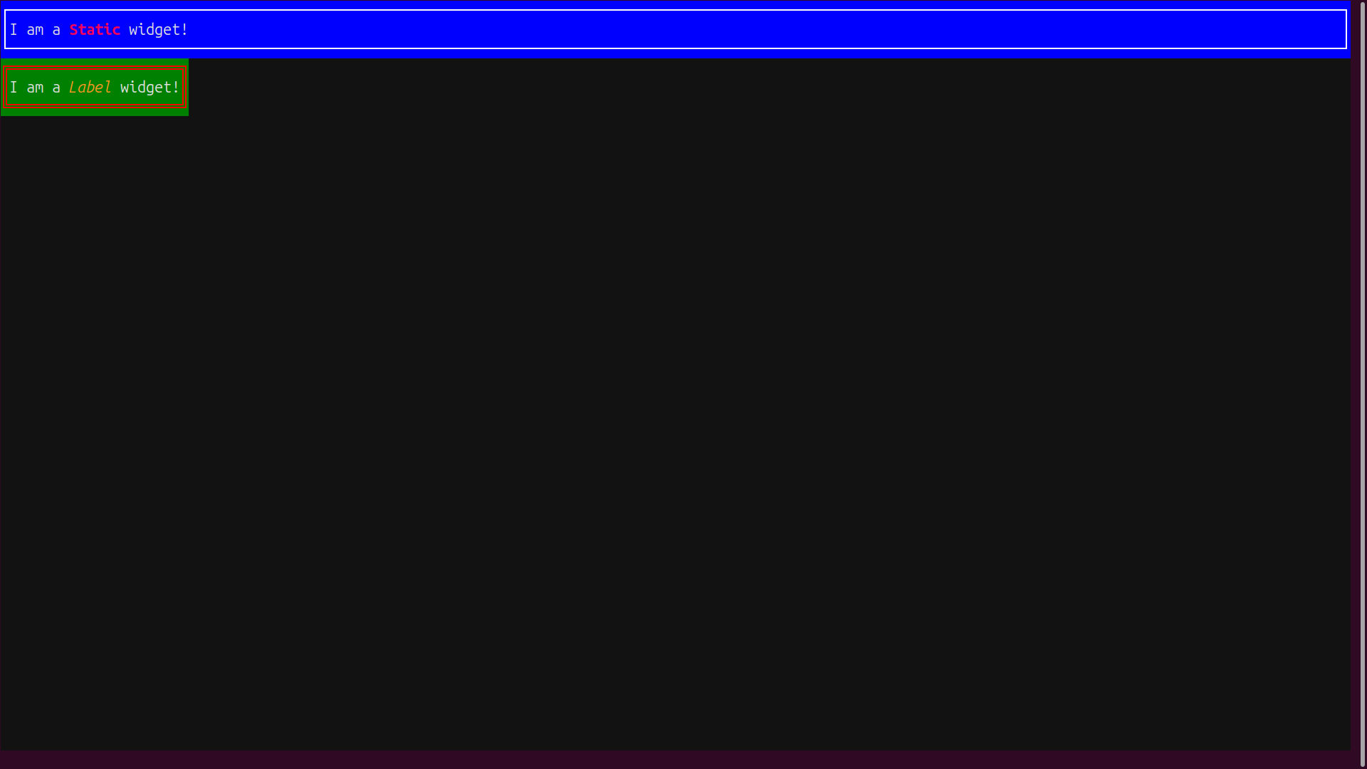
The Static and Label instances are formatted to your specifications, but you’ll notice a small difference in their default formats. The Static widget expands horizontally to fill the screen, while the default behavior of the Label is to adjust its content’s width.
You can always override these default behaviors if you wish. For example, if you specified style.width = 100% on the Label and style.width = auto on the Static, then their width behaviors would be reversed.
Button and Input Widgets
Textual provides text-based versions of nearly all the controls you’d expect in a modern UI. Buttons and text inputs are two building-block widgets that you’ll use in almost any UI app. This next example introduces Textual’s version of these widgets:
buttons_and_inputs.py
 1from textual.app import App
 2from textual.widgets import Button, Input
 3
 4class ButtonsAndInputsApp(App):
 5    def compose(self):
 6        # Buttons
 7        yield Button("Click me!")
 8        yield Button("Primary!", variant="primary")
 9        yield Button.success("Success!")
10        yield Button.warning("Warning!")
11        yield Button.error("Error!")
12        # Inputs
13        yield Input(placeholder="Type your text here")
14        yield Input(placeholder="Password", password=True)
15        yield Input(
16            placeholder="Type a number here",
17            type="number",
18            tooltip="Digits only please!",
19        )
20
21if __name__ == "__main__":
22    app = ButtonsAndInputsApp()
23    app.run()
This example shows just a few of the many possible ways of constructing Button and Input widgets. By default, the widgets are arranged vertically on the screen, in the order in which they appear in the code.
On line 7, you create a vanilla Button with the text "Click me!" It’s a rather drab black-and-white button.
The Button class has several variants, each using different colors and styles. For example, line 8 uses the parameter variant="primary", while lines 9 to 11 show off some convenience constructors for Button widgets with other variants.
Variants are mapped to colors via Textual’s system of themes, so the user can change all your app’s colors at once by selecting another theme through the built-in command palette. This palette can be accessed by pressing Ctrl+P while the app is running. You can also hard-code widget colors if you prefer. You’ll see examples of both approaches shortly.
Next, you have the Input widget, which has a range of parameters that let you customize its behavior. Each Input in this example has a placeholder text. This text appears only when the input field is empty and prompts the user to type what they’re expected to.
Line 14 creates an Input with password=True so that the text typed by the user is hidden. Lines 15 to 19 specify an Input that accepts only numbers. This Input also has a tooltip, which provides a pop-up label that appears when the mouse cursor hovers near the widget.
Go ahead and run your app now:
(venv) $ python buttons_and_inputs.py
Although your widgets aren’t yet hooked up to any events or actions, they still show some interesting built-in behavior. Notice how the themed Button widgets are animated as you move the mouse over them or click them. Try typing into the Input widgets and observe how their behavior differs:
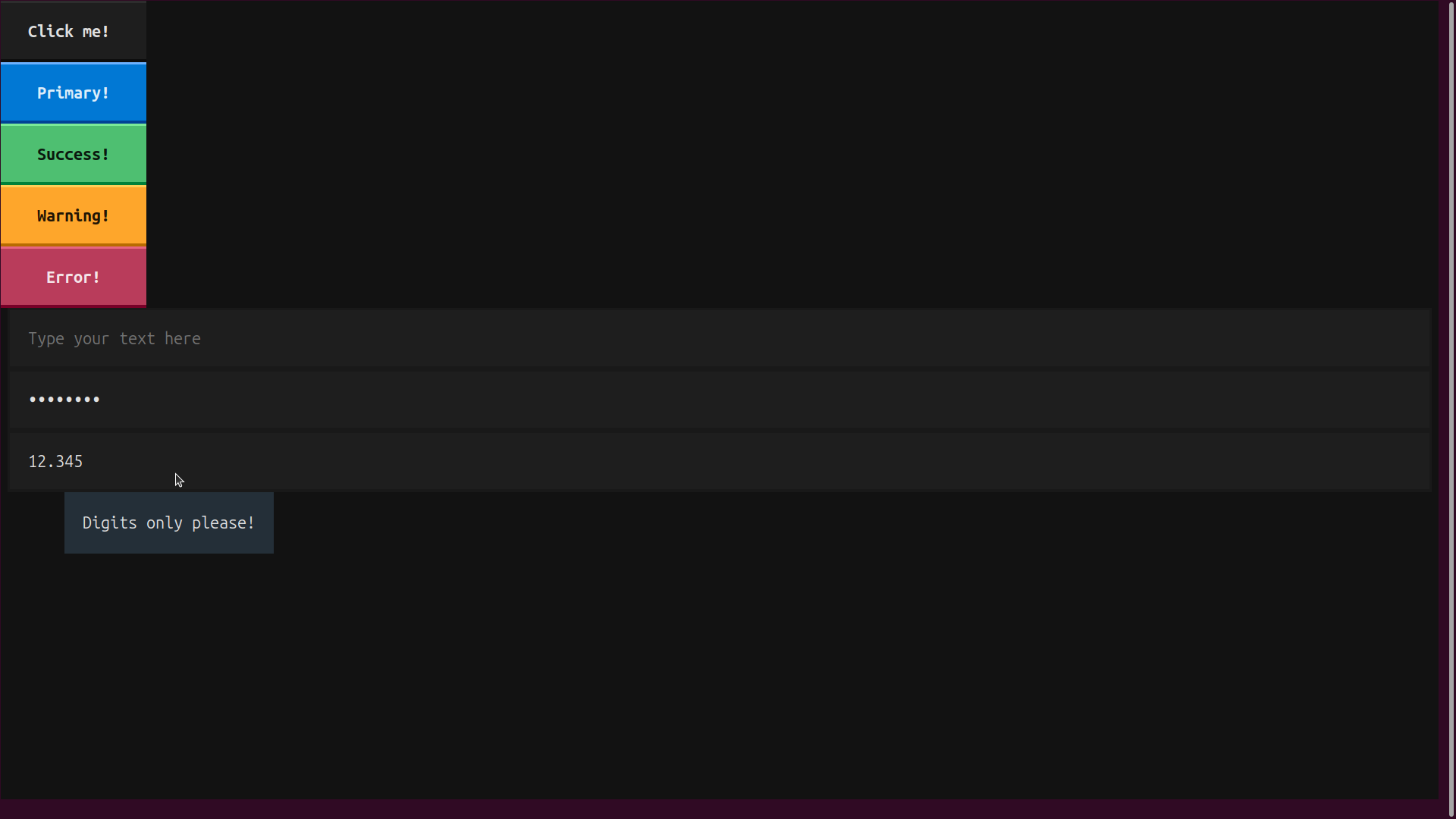
The Input with password=True hides the input text, and the Input with type="number" ignores non-numeric inputs.
You’ve created an app with some prebuilt interactive components, but they don’t do much yet. You’ll explore ways to integrate them with your app’s logic in the section on events and actions.
Advanced Widgets
Textual has many prebuilt widgets. You’ll find classic UI widgets, such as labels, buttons, radio buttons, inputs, and text areas. You’ll also find advanced widgets, including the following:
Treeprovides a collapsible hierarchical displaySparklineis a compact histogramSwitchprovides an on and off switchPrettyis a pretty-printed display of a Python object
There are also widgets like TabbedContent that facilitate navigation between multiple screens, giving your application a multi-page look and feel. The Textual doc on widgets has all the details about using these widgets and provides usage examples for each one.
Now that you have a better understanding of widgets, it’s time to learn about the powerful styling options Textual provides for customizing the appearance of your application.
Styling Your Application With Textual’s CSS
With Textual, you can apply different styles to text, such as foreground and background colors, bold, italics, underline styles, and more.
In the section on Static and Label widgets, you learned one way of applying initial styles to your widgets. You saved references to the widgets while constructing them, and then applied attributes to each widget’s .styles member variable in the app’s .on_mount() event handler.
Unfortunately, this approach clutters your Python code with a lot of styling information that’s not relevant to your main program logic. Thankfully, there’s a better way: using Textual Cascading Style Sheets (TCSS).
TCSS implements a modified and simplified subset of the cascading style sheets (CSS) language used for web pages. Your static styles can be specified in a text file that’s separate from your Python code. This text file is usually given a .tcss extension.
Styles and text can also be modified dynamically in the code, letting you create responsive, visually appealing interfaces. Textual supports all the rich-text styling options of the Rich library, including text colors and attributes, frames, emojis, and even animations.
TCSS lets you style your application in a text file without cluttering the Python code with visual design details. This helps you focus on the application logic, while the style file uses a compact syntax.
Here’s how you can clean up the example of Static and Label widgets using external styles:
static_and_label_tcss.py
from textual.app import App
from textual.widgets import Static, Label

class StaticAndLabelAppWithTCSS(App):
    CSS_PATH = "static_and_label.tcss"

    def compose(self):
        yield Static(
            "I am a [bold red]Static[/bold red] widget!",
            )
        yield Label(
            "I am a [yellow italic]Label[/yellow italic] widget with an id!",
            id="label_id",
        )
        yield Label(
            "I am a [yellow italic]Label[/yellow italic] widget with a CSS class!",
            classes="label_class",
        )

if __name__ == "__main__":
    app = StaticAndLabelAppWithTCSS()
    app.run()
The highlighted line references your external TCSS file. When you define the App class constant CSS_PATH, Textual automatically loads the provided file and uses it to style the UI. Now, you don’t need to keep code references to the widgets, since the .tcss file can reference them in various ways.
Here’s the style file for StaticAndLabelAppWithTCSS:
static_and_label.tcss
Static {
    background: blue;
    border: solid white;
    padding: 1 1;
    margin: 2 2;
    text-align: center;
}

#label_id {
    color: black;
    background: red;
    border: solid black;
    padding: 1 1;
    margin: 2 4;
}

.label_class {
    color: black;
    background: green;
    border: dashed purple;
    padding: 1 1;
    margin: 2 6;
}
The syntax is modeled on the CSS language used in styling web pages. Like CSS, TCSS makes use of selectors to target widgets to style. You can select widgets using their Python class name, their unique ID, or their TCSS class name.
For illustrative purposes, you select each widget in a different way:
- The
Staticwidget is selected by its Python class name. If you added moreStaticwidgets, they would all receive the same styles. - The first
Labelwidget is selected by its ID. A widget’s ID is assigned when it is constructed, and it should be unique within the application. - The second
Labelis selected by a TCSS class. The same TCSS class can be applied to multiple widgets. This provides a convenient way to add and remove styling dynamically.
TCSS classes have nothing to do with Python classes. They’re identifiers used for grouping and organizing style attributes. They’re often added to a widget during construction using its classes argument. However, TCSS classes, unlike IDs, can be freely added to or removed from a widget.
You can also use TCSS class names as search keys by a DOM query in your Python code. The query will target all the widgets that currently contain the requested classes.
Note: There’s a lot more to know about TCSS. For a deeper dive into the topic, check the Textual doc on TCSS. Because TCSS is so similar to CSS, you can also take a look at the HTML and CSS for Python Developers tutorial.
Run the example with external styling:
(venv) $ python static_and_label_tcss.py
You’ll get the same result as before, but now your Python code is cleaner. Now, you’re ready to learn about the Textual development tools and the benefits they provide.
Using the textual-dev Development Tools
The textual-dev package gives you access to the Textual console, which gives you a convenient workflow for working with styles. Instead of using the python command to run your application, you can start the Textual console in your command line:
(venv) $ textual console
This command triggers the Textual console that looks something like the following:
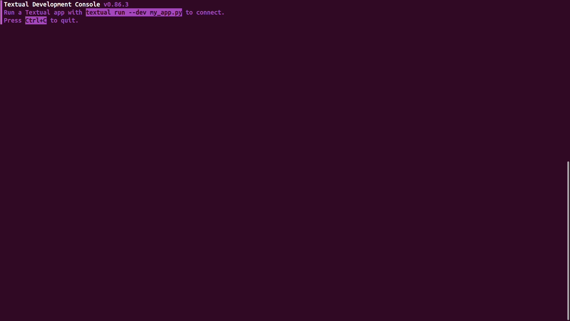
This window will show the debugging output of your app once it’s running, including log messages, errors, and the output of any print() call you include in your code.
You can see the Textual console in action by running your app with textual in another OS window:
(venv) $ textual run --dev static_and_label_tcss.py
In this second window, your Textual app executes and everything looks just as before. But in the textual console window, you can see a nicely formatted, colorized log of everything that’s happening in the application. Try clicking on the app window to see the events flowing in the log. You can add your own print() calls in the source code for debugging purposes, and the output will appear in the Textual console window.
Perhaps the nicest aspect of using textual run --dev instead of a plain python command is that you no longer need to restart the application when you make changes in the .tcss file. For example, if you change some style details in your static_and_label.tcss file, as soon as you save your changes, they’ll appear in the running app. This makes incremental design changes much easier to test.
Note: You could use the Textual console for running all the examples in this tutorial. Keep in mind, though, that this is just a convenience for development. All of the .py files you create can also be run from the command line in the usual way. The apps will run exactly as they do in the Textual console, but without the extra debugging facilities.
Another useful feature of the Textual console is that it can act as a web server. To see your application running as a web page in your browser, you just need to use the serve command:
(venv) $ textual serve static_and_label_tcss.py
Then, you can open your browser at http://localhost:8000 to see the result. You can also specify a target server host and port using the --host=<hostname> and --port=<port> options in the textual serve command.
Laying Out Textual UIs With Containers
Textual widgets can be nested and combined to create intuitive user interfaces and minimize code reuse. The visual hierarchy is usually defined in Python code using containers. Container classes help you lay out your UIs.
Besides straightforward rectangular schemes, they also support multiple views, split panes, and more. In the following sections, you’ll learn the basics of Textual containers and how to use them to arrange widgets effectively, to build visually appealing and functional UIs.
Vertical Containers
In your first two apps, you implicitly used a Vertical container. The default layout in Textual is Vertical, which is why your widgets are all lined up in a column.
Textual containers are implemented as context managers, so you can use them on a with statement. For example, a Vertical container stacks its elements vertically:
vertical_layout.py
 1from textual.app import App
 2from textual.containers import Vertical
 3from textual.widgets import Static
 4
 5NUM_BOXES = 4
 6
 7class VerticalLayoutApp(App):
 8    def compose(self):
 9        with Vertical():
10            for i in range(NUM_BOXES):
11                static = Static(f"Static {i + 1}")
12                static.styles.border = ("solid", "green")
13                yield static
14
15        # for i in range(NUM_BOXES):
16        #     static = Static(f"Static {i + 1}")
17        #     static.styles.border = ("solid", "green")
18        #     yield static
19
20if __name__ == "__main__":
21    app = VerticalLayoutApp()
22    app.run()
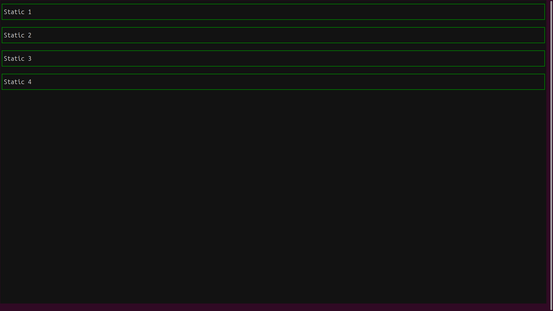
The NUM_BOXES constant on line 5 determines how many widgets will be stacked. Line 9 introduces the context manager. Everything nested beneath it in lines 10 to 13 will be managed by a Vertical container, which stacks the widgets vertically on the screen.
Because the Vertical container is the default, you could achieve the same effect by replacing the with Vertical() stanza with the commented code below it.
Run the example to see the effect:
(venv) $ python vertical_layout.py
The Static widgets line up in a vertical column:
The vertical_layout.py app uses Python code to apply styles to the Static widgets. You can achieve the same result using an external .tcss file:
vertical_layout_tcss.py
from textual.app import App
from textual.containers import Vertical
from textual.widgets import Static

NUM_BOXES = 4

class VerticalLayoutAppWithTCSS(App):
    CSS_PATH="vertical_layout.tcss"

    def compose(self):
        with Vertical():
            for i in range(NUM_BOXES):
                yield Static(f"Static {i + 1}")

if __name__ == "__main__":
    app = VerticalLayoutAppWithTCSS()
    app.run()
The vertical_layout_tcss.py example references a .tcss file that may look like the following:
vertical_layout.tcss
Static {
    border: solid green;
}
You can run this version as usual:
(venv) $ python vertical_layout_tcss.py
The output will be identical to that from vertical_layout.py.
Recall that NUM_BOXES determines the number of widgets to be stacked. In either version of the vertical layout app, try changing NUM_BOXES to a larger number, say 20. If you do this, you’ll have too many widgets to fit vertically on the screen. Some of them will disappear and become inaccessible.
Fortunately, Textual provides a quick solution to this type of issue. You can use the VerticalScroll container:
vertical_scroll.py
from textual.app import App
from textual.containers import VerticalScroll
from textual.widgets import Static

NUM_BOXES = 20

class VerticalScrollApp(App):
    CSS_PATH="vertical_layout.tcss"

    def compose(self):
        with VerticalScroll():
            for i in range(NUM_BOXES):
                yield Static(f"Static {i + 1}")

if __name__ == "__main__":
    app = VerticalScrollApp()
    app.run()
You can use the same external TCSS file as for vertical_layout.py. Run the vertical scrolling example:
(venv) $ python vertical_scroll.py
The new container class, VerticalScroll, is a drop-in replacement for Vertical that can accommodate an unlimited number of widgets:
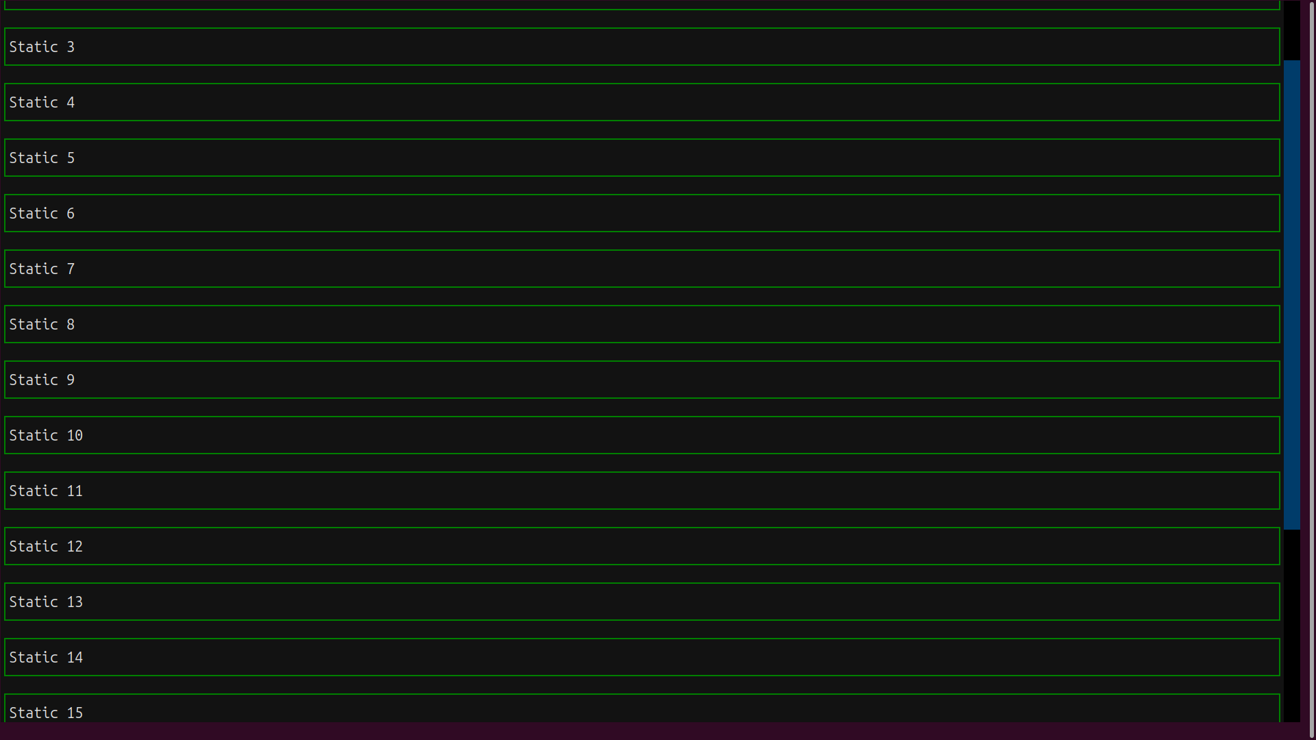
The scrollbar on the right of the display allows you to scroll through all the boxes, using mouse gestures, the mouse scroll wheel, or the up and down arrow keys.
Horizontal Containers
A Horizontal container works in a similar way to the Vertical container but places the widgets horizontally:
horizontal_layout.py
 1from textual.app import App
 2from textual.containers import Horizontal
 3from textual.widgets import Static
 4
 5NUM_BOXES = 4
 6
 7class HorizontalLayoutApp(App):
 8    def compose(self):
 9        with Horizontal():
10            for i in range(NUM_BOXES):
11                static = Static(f"Static {i + 1}")
12                static.styles.border = ("solid", "green")
13                static.styles.width = "10%"
14                yield static
15
16if __name__ == "__main__":
17    app = HorizontalLayoutApp()
18    app.run()
Again, the with Horizontal() stanza on lines 9 to 14 determines the layout of the app. Here, you need to specify the width of each widget, which you do on line 13. Otherwise, the first widget will expand and claim all the horizontal space.
You can run the example in the usual way:
(venv) $ python horizontal_layout.py
Here’s how it looks with NUM_BOXES set to 4:
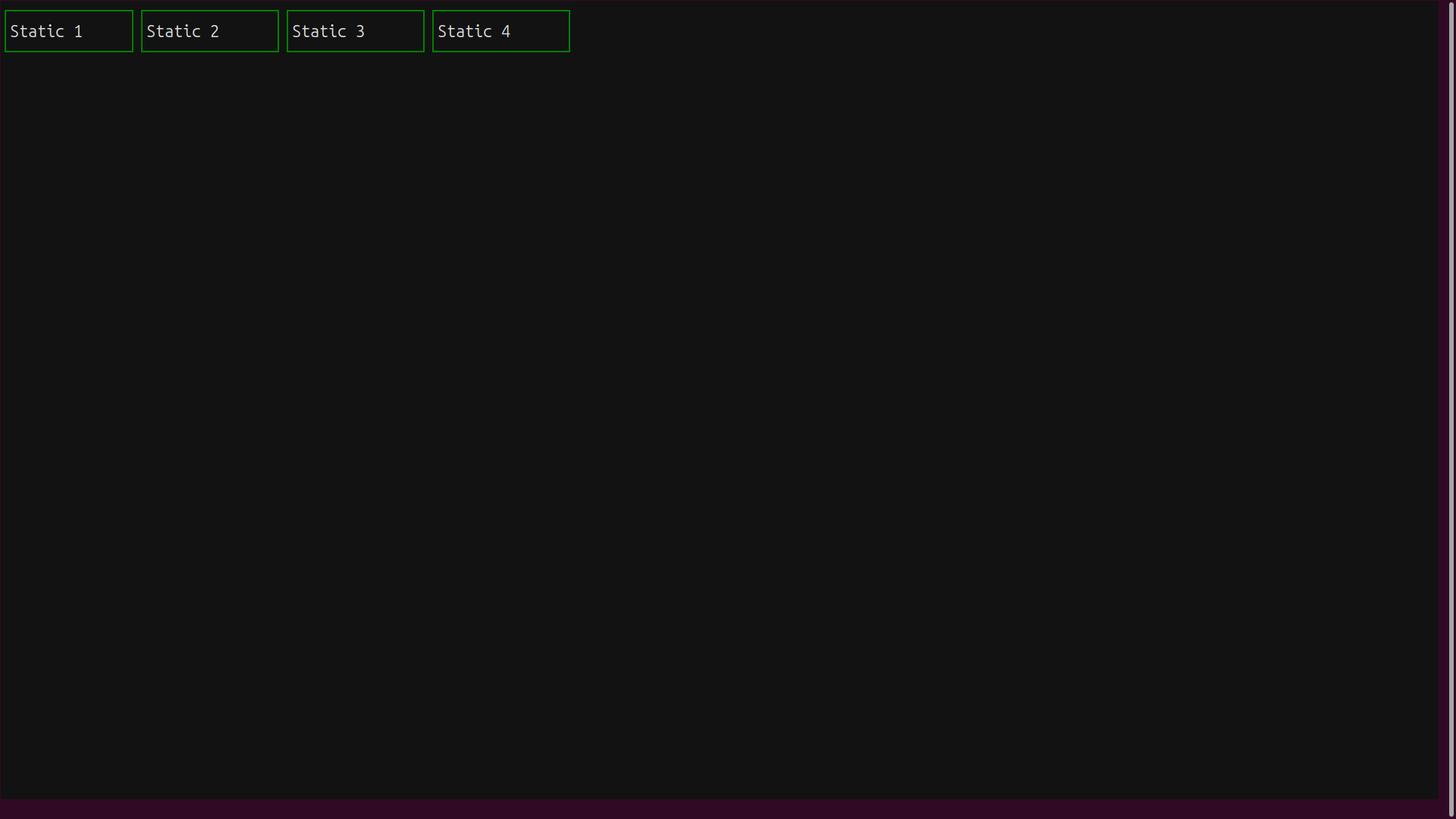
The widgets are laid out neatly in a horizontal row sharing the available space.
Again, the Horizontal container works well for a small number of widgets. Setting NUM_BOXES to a larger number will cause the display to overflow horizontally, and some boxes will become inaccessible. The solution is once again to use the scrolling variant of the container:
horizontal_scroll.py
from textual.app import App
from textual.containers import HorizontalScroll
from textual.widgets import Static

NUM_BOXES = 20

class HorizontalScrollApp(App):
    def compose(self):
        with HorizontalScroll():
            for i in range(NUM_BOXES):
                static = Static(f"Static {i + 1}")
                static.styles.border = ("solid", "green")
                static.styles.width = "10%"
                yield static

if __name__ == "__main__":
    app = HorizontalScrollApp()
    app.run()
The only change from the previous app is that now you’re using the HorizontalScroll container class. You’ve set NUM_BOXES to 20 to ensure the scrolling effect is visible.
Run your horizontal scrolling demo:
(venv) $ python horizontal_scroll.py
Now you can scroll through all the widgets:
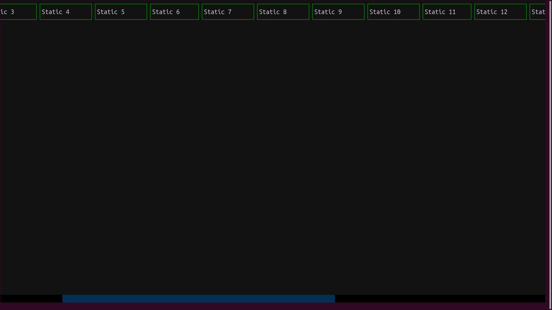
This time, the scroll bar appears automatically at the bottom of the screen. You can manipulate it using the mouse or the Left and Right arrow keys.
Note: You could achieve the same scrolling effects by using Horizontal and Vertical with a judicious choice of TCSS properties, but the predefined scrollable containers make this much easier when only one axis of scroll is required.
You’re not limited to a single container class per app. In principle, Horizontal and Vertical containers can be nested indefinitely to make complex layouts.
Docked Widgets
An entirely different layout option is dock. It’s not a container-based option since a docked widget completely ignores the layout rules defined by its parent container.
Docks stick to their assigned position: top, left, bottom, or right within the container. The container’s other widgets get laid out according to the container’s rules, even if this results in overlaps with the docked widget.
Nested Containers and Docked Widgets
You can nest containers and combine them to create complex UI layouts. This next example will combine horizontal and vertical containers with a docked widget:
layouts.py
from textual.app import App
from textual.containers import (
    Horizontal,
    HorizontalScroll,
    VerticalScroll,
)
from textual.widgets import Label, Static

NUM_BOXES = 12

class NestedContainersApp(App):
    CSS_PATH = "layouts.tcss"

    def compose(self):
        with Horizontal(id="horizontal"):
            yield Static("Left", classes="box")
            with HorizontalScroll(id="horizontalscroll"):
                for i in range(NUM_BOXES):
                    yield Static(
                        f"Center.{i + 1}",
                        classes="box yellowbox",
                    )
            with VerticalScroll(id="verticalscroll"):
                for i in range(NUM_BOXES):
                    yield Static(
                        f"Right.{i + 1}",
                        classes="box redbox",
                    )
                yield Label(
                    "I am a docked label.\nI don't move!",
                    id="docked-label",
                )

if __name__ == "__main__":
    app = NestedContainersApp()
    app.run()
As always, the .compose() method defines the UI structure. First, you declare the overall layout manager as a Horizontal container. Within this container, you have a Static widget, a HorizontalScroll container, and a VerticalScroll container.
Each of the scrolling containers holds twelve Static objects, too many to display all at once. In addition, the VerticalScroll contains a Label that will be docked inside it.
Textual widget constructors have an optional classes argument that accepts a series of TCSS class names in a space-separated string. These correspond to TCSS classes defined in a .tcss file that you’ll see in a moment.
Note: Recall that even though TCSS classes are mostly used to apply styles, they also serve as query targets to locate the relevant sub-widgets in the app’s DOM for dynamic updates. This can be useful when you want to update a group of related widgets. You can’t use an ID for that because TCSS IDs must be unique.
The linked layouts.tcss file below declares the relevant TCSS:
layouts.tcss
.box {
    height: 1fr;
    width: 1fr;
    background: $panel;
    border: solid white;
}

.redbox {
    border: heavy red;
    height: 5;
}

.yellowbox {
    border: heavy yellow;
    width: 10;
}

#docked-label {
    dock: bottom;
    border: solid dodgerblue;
}
The .box class defines the general style that will make widgets look like boxes with a colored border. Note that you’ve specified the height and width in fr values. This unit represents a fraction of the available space. If all the widgets get 1fr, then each will occupy the same space.
Next, you have two more specific classes: .redbox and .yellowbox. They add or override some style attributes.
The #docked-label ID is applied to the label defined within the VerticalScroll container. This ID selector positions the label at the container bottom using the dock attribute. This positioning is completely independent of the container’s layout.
You can run your app to see the various layout effects:
(venv) $ python layouts.py
The resulting app will look something like this:
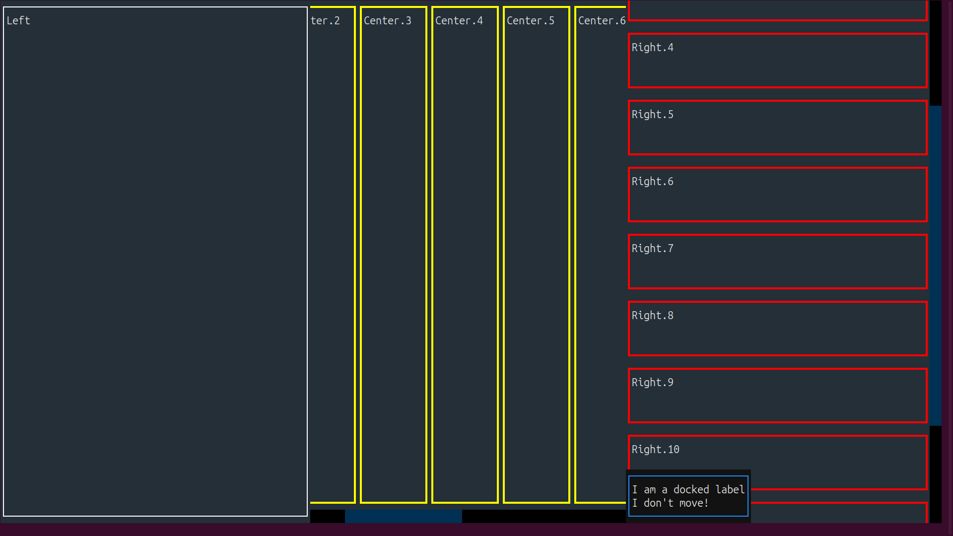
The leftmost widget is a plain Static. The HorizontalScroll in the center panel scrolls horizontally, and the VerticalScroll in the rightmost part scrolls vertically. The docked label remains fixed in its place within the VerticalScroll container while the other widgets scroll past it.
When you resize the screen, the layout will adapt smoothly!
Grid Container
The Grid container allows you to specify a number of rows and columns for your UI. As you yield each widget or container in your .compose() method, it’s automatically allocated to a grid position. The columns in the first row are filled, then the columns in the second row, and so on.
You have many styling options to customize this container. You can assign a height to each row and a width to each column. You can make individual cells span multiple rows or columns. You can specify gutters to reserve space between the rows and columns. And of course, you can color, frame, and add content to each individual cell or container within the grid.
Here’s an example to illustrate the flexibility of the Grid container:
grid.py
from textual.app import App
from textual.containers import Grid
from textual.widgets import Static

class GridLayoutApp(App):
    def compose(self):
        grid = Grid()
        grid.styles.grid_size_rows = rows = 6
        grid.styles.grid_size_columns = cols = 4
        with grid:
            for row in range(rows):
                for col in range(cols):
                    static = Static(f"Static ({row=}, {col=})")
                    static.styles.border = ("solid", "green")
                    static.styles.width = "1fr"
                    static.styles.height = "1fr"
                    yield static

if __name__ == "__main__":
    app = GridLayoutApp()
    app.run()
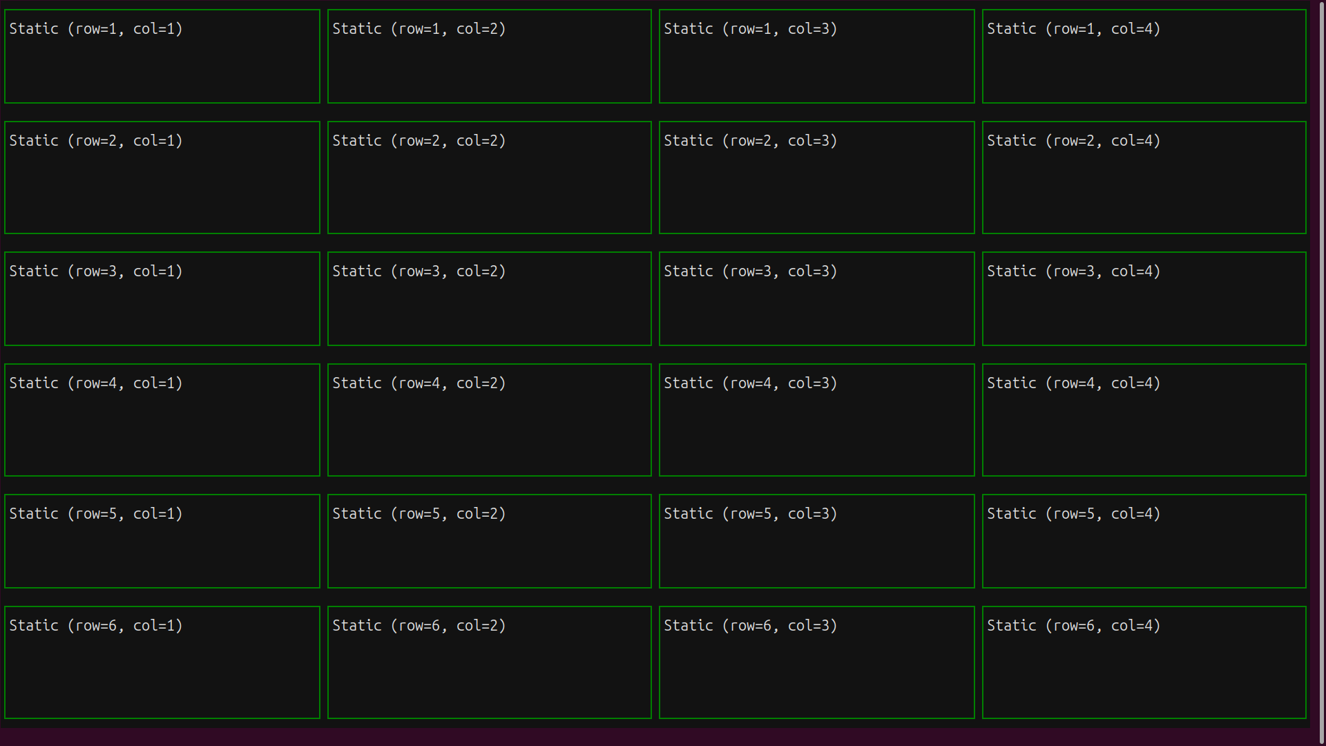
You’ve defined a Grid container with six rows and four columns. The Static widgets will automatically populate this grid from left to right and from top to bottom.
Now you can run your app:
(venv) $ python grid.py
The widgets are arranged as specified, and display their row and column numbers:
Note that by nesting grids together with other containers, you can craft almost any reasonable screen design.
You can also use an external TCSS file to build the above app. Here’s how:
grid_tcss.py
from textual.app import App
from textual.containers import Grid
from textual.widgets import Static

class GridLayoutWithTCSS(App):
    CSS_PATH = "grid.tcss"

    def compose(self):
        with Grid():
            for row in range(6):
                for col in range(4):
                    yield Static(f"Static ({row=}, {col=})")

if __name__ == "__main__":
    app = GridLayoutWithTCSS()
    app.run()
The highlighted line references the external TCSS file, which has the following styling rules for the app:
grid.tcss
Grid {
    grid_size: 4 6;
}

Static {
    height: 1fr;
    width: 1fr;
    border: solid green;
}
First, you have the Grid class that defines a grid of four columns and six rows. Then you have the Static class that defines some styling for the Static widget.
You can run this version:
(venv) $ python grid_tcss.py
The result is the same as for the non-TCSS version. In general, TCSS is pretty useful for defining an app’s layout. It can simplify your Python code and facilitate how you style and configure your widgets and containers.
Handling Events and Actions in Textual Apps
Up to this point, you’ve seen how to style and layout your Textual applications using either Python code or TCSS code in an external .tcss file. However, you haven’t yet learned how to make your apps perform real computations in response to user interactions.
You’ll have two major ways for the user to interact with your Textual apps:
-
Events are usually triggered by a user interaction with a UI, such as a mouse click or a keystroke. They can also be associated with a timer tick or the arrival of a network packet. You’ll process events using event handlers, which are methods that do something when the event occurs.
-
Actions are usually triggered by a specific user action, such as a keypress or a click on a hotlink in some text. You’ll process an action with a regular method prefixed with
.action_and followed by the action’s name.
In Textual, you can create event handlers in two different ways:
- Prefix the method with
.on_followed by the name of the event - Use the
@ondecorator on the handler method
Once an event or action has occurred, the event handler or action method gets control. Here’s an example of an app that handles user actions and events:
events.py
 1# from textual import on
 2from textual.app import App
 3from textual.widgets import Button, Digits, Footer
 4
 5class EventsApp(App):
 6    CSS_PATH = "events.tcss"
 7    BINDINGS = [
 8        ("q", "quit", "Quit"),
 9        ("b", "toggle_border", "Toggle border"),
10    ]
11
12    presses_count = 0
13    double_border = False
14
15    def compose(self):
16        yield Button("Click me!", id="button")
17        digits = Digits("0", id="digits")
18        digits.border_subtitle = "Button presses"
19        yield digits
20        yield Footer()
21
22    def action_toggle_border(self):
23        self.double_border = not self.double_border
24        digits = self.query_one("#digits")
25        if self.double_border:
26            digits.styles.border = ("double", "yellow")
27        else:
28            digits.styles.border = ("solid", "white")
29
30    def on_button_pressed(self, event):
31        if event.button.id == "button":
32            self.presses_count += 1
33            digits = self.query_one("#digits")
34            digits.update(f"{self.presses_count}")
35
36    # @on(Button.Pressed, "#button")
37    # def button_pressed(self, event):
38    #     self.presses_count += 1
39    #     digits = self.query_one("#digits")
40    #     digits.update(f"{self.presses_count}")
41
42if __name__ == "__main__":
43    app = EventsApp()
44    app.run()
In lines 7 to 10, you define the BINDINGS constant. It’s a list of three-value tuples representing the binding between keystrokes and actions. The first element of each tuple is the key to be bound. The second element is a string representing the method that will perform the action. The third element is the visible text.
This app introduces two new widgets:
Digitssupports the large-format display of digits using line graphic characters.Footerprovides a footer for your app display and also automatically shows prompts for any defined keyboard actions.
EventsApp includes two actions. Line 8 declares the Quit action, which is bound to the Q key. Because the Quit action is such a common requirement, Textual implements it for you.
Line 9 defines the Toggle border action, which is bound to the B key. The action method is .action_toggle_border(). Each time the action is invoked, this code toggles the border of the Digits widget from single to double or from double to single.
Lines 30 to 34 declare the .on_button_pressed() event handler. This method runs when the user clicks the Click me! button. The handler’s event parameter carries information about the triggering event. You’ll use this argument to verify the source of the event before updating the Digits element.
An alternative event-handler syntax is shown in the commented code. After importing the on decorator in line 1, you can use it to decorate the handler method in lines 37 to 40, which may be given any name. The decorator syntax in line 36 declares this method as the handler for a button-pressed event and also ensures that it’s called only if the source of that event has the button ID.
In event handlers, you need some way to reference the widgets. Textual’s DOM keeps all the widgets in a hierarchy and lets you use queries to locate them. Because of this querying mechanism, you don’t need to keep references to the widgets you create in your code.
These queries allow you to find widgets using the following properties:
- The Python class name
- The widget’s ID
- The widget’s TCSS classes
- The widget’s position in the DOM hierarchy
- A combination of these
In events.py, you’ve assigned IDs to certain widgets using the id argument in their constructors. Each ID must be unique within the DOM, which allows DOM queries to locate specific widgets at runtime.
Textual provides several DOM-querying methods that are available to all Widget subclasses. Depending on your needs, you can locate a single widget with .query_one() or a whole collection of widgets with .query(). In the example above, you use self.query_one("#digits") in the .action_toggle_border() method to get a reference to the Digits widget via its ID.
Textual always calls event handlers with an event argument. This object contains useful information about the event that triggered the call. In this example, your app uses event.button.id to check that the event has come from the correct button.
The events.tcss file for the events.py app showcases some new features:
events.tcss
 1Button {
 2    background: $secondary;
 3    border: solid $primary;
 4    margin: 2 2;
 5}
 6
 7Button:hover {
 8    border: round white;
 9}
10
11#digits {
12    color: green;
13    border: solid white;
14    padding: 1;
15    width: 30;
16}
The :hover suffix in line 7 is a pseudoclass. The indicated styles are applied to the widget only when the mouse cursor is hovering over the control. In this example, the Button gets a different border style when the cursor is hovering over it to make it pop out visually. Finally, the #digits rule specifically targets the widget with that ID in the app’s DOM.
Now, you’re ready to run the example:
(venv) $ python events.py
Here’s the result, with the cursor over the Button:
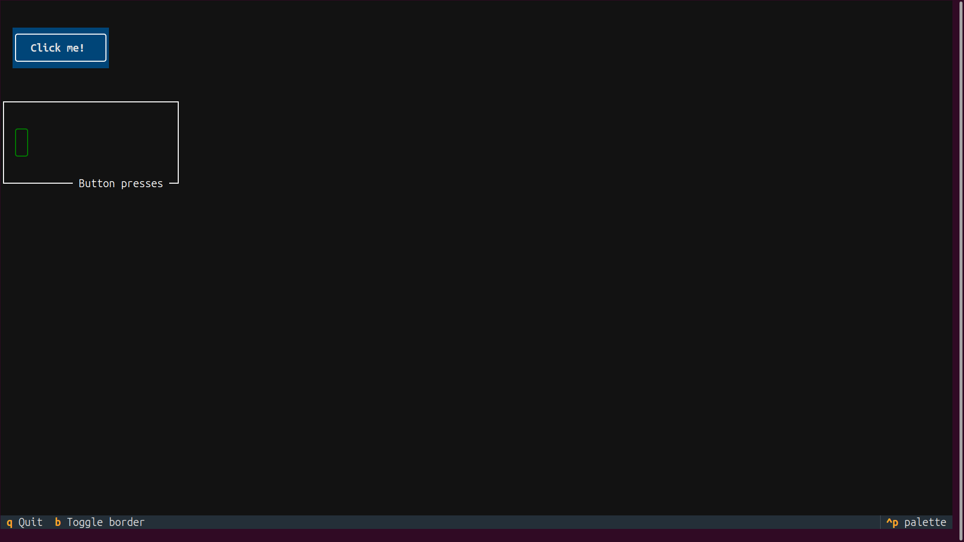
Try clicking the button to update the counter. Press the B key, or click the b in the footer to toggle the border style around the Digits. Finally, press Q to quit the application.
Conclusion
You’ve learned how to build text-based user interface (TUI) apps for the terminal using the Python Textual framework. You’ve also explored how to create, style, and enhance Textual apps with various widgets, layouts, events, and actions.
Textual is a great library for Python developers who want to create efficient and platform-independent TUI apps, especially in environments where graphical user interfaces may not be feasible.
In this tutorial, you’ve learned how to:
- Install and set up Textual for building text-based interface apps
- Create and style widgets using Python code and TCSS
- Build and lay out user interfaces with Textual containers
- Handle events and actions to make your applications interactive
With these skills, you can now create complex and engaging text-based interfaces for your applications, improving user interaction and experience in terminal environments.
These examples have given you some idea of the power and versatility of Textual, but there’s a lot more to discover about this framework! For a deeper dive, check out the official Textual guide on the Textual website. For a more practical application, see Build a Contact Book App With Python, Textual, and SQLite.
Get Your Code: Click here to download the free sample code that shows you how to use Python Textual to Build Beautiful UIs in the Terminal.
Frequently Asked Questions
Now that you have some experience with Python Textual, you can use the questions and answers below to check your understanding and recap what you’ve learned.
These FAQs are related to the most important concepts you’ve covered in this tutorial. Click the Show/Hide toggle beside each question to reveal the answer.
You can create a text-based user interface in Python using the Textual framework, which provides a set of widgets, containers, event-handling mechanisms, and styling options for building visually appealing and interactive TUI apps.
Text-based user interfaces are efficient, platform-independent, and can operate over remote connections in low-resource environments, making them ideal for server management and remote development tasks.
You can install Textual in Python by creating a virtual environment and running the command python -m pip install textual within the activated environment.
Textual is a framework for building TUI applications for the terminal, while Rich is a library for adding rich text formatting to the terminal. Textual leverages Rich to enhance the visual appeal and functionality of its terminal applications.
Take the Quiz: Test your knowledge with our interactive “Python Textual: Build Beautiful UIs in the Terminal” quiz. You’ll receive a score upon completion to help you track your learning progress:
Interactive Quiz
Python Textual: Build Beautiful UIs in the TerminalIn this quiz, you'll test your understanding of the Python Textual library. This library is used to create rich terminal applications and widgets. By working through this quiz, you'll reinforce your knowledge of Textual's key concepts and features.
